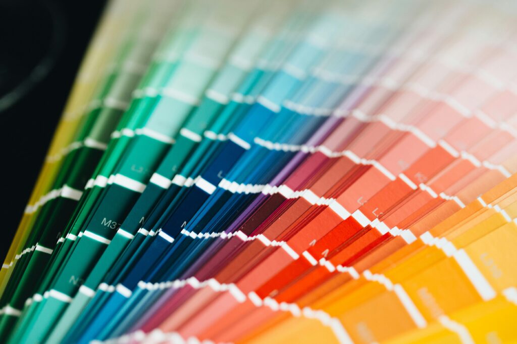
The Color of the Year is not a random choice, it is the result of global analysis by the Pantone Color Institute, a team that studies cultural, social, artistic and design trends. The Pantone Color Institute was created in 1999 as an educational program and the first color to be proclaimed Color of the Year in 2000 was Cerulean (light blue). Since then, Pantone selects a color each year that reflects society's mood and emotional needs.
Over the years, Pantone has chosen colors that represent different emotional states and social transformations. This is the complete list since the initiative began in 2000:
2000 Cerulean - 2001 Fuchsia Rose - 2002 True Red - 2003 Aqua Sky - 2004 Tigerlily - 2005 Blue Turquoise - 2006 Sand Dollar - 2007 Chili Pepper - 2008 Blue Iris - 2009 Mimosa - 2010 Turquoise - 2011 Honeysuckle - 2012 Tangerine Tango - 2013 Emerald - 2014 Radiant Orchid - 2015 Marsala - 2016 Rose Quartz & Serenity - 2017 Greenery - 2018 Ultra Violet - 2019 Living Coral - 2020 Classic Blue - 2021 Ultimate Gray & Illuminating - 2022 Very Peri - 2023 Viva Magenta - 2024 Peach Fuzz - 2025 Future Dusk - 2026 Cloud Dancer.
Looking at this chromatic evolution is almost like reading an emotional diary of the last decades: each shade reflects a moment, a collective need or a shared aspiration.
The annual choice of the color of the year was made to highlight the relationship between global culture and the language of color. It influences every year in sectors such as fashion, interior design, branding, consumer products and all kinds of trends. Pantone is a world reference in chromatic trends and its selection marks in which direction the palettes we will see during the year will go in homes, interior design magazines, shop windows, new products or fashion collections.
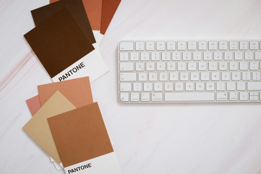
This 2026, Pantone has selected PANTONE 11-4201 Cloud Dancer as Color of the Year, a white that symbolizes calm, serenity and new beginnings. According to Pantone's official announcement, this shade represents “a whisper of tranquility and peace in a noisy world”, it is the blank canvas that invites us to bring out our creative side. This is the first time a white has been chosen as the color of the year, underlining how much we need this tranquility, balance and reflection in today's social context.
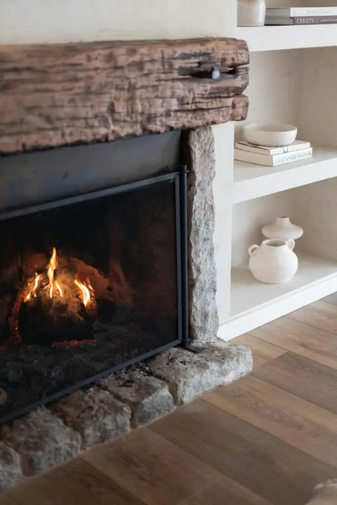
The Color of the Year selection process also has a direct impact on how we perceive spaces. In interior design, each color conveys different sensations and can influence our mood. That's why, when Pantone announces its choice, design and decoration professionals incorporate it as a reference to create environments that connect with the emotions of the moment. In 2026, Cloud Dancer invites us to recover calm and clarity, two values that are reflected in brighter, minimalist and balanced homes.
For those who work in decoration, design or branding, knowing the Color of the Year is not only a curiosity, but a strategic tool. It allows to anticipate trends, connect with the public from a visual language and create current and relevant proposals. In the case of Cloud Dancer, its neutrality and softness make it a versatile color, easy to integrate into any style and perfect for transmitting serenity in a world that seeks, more than ever, spaces that breathe harmony.